In the picture above, she seems to use warm colors, but adds a splash of lime here and there.

David Bromstad

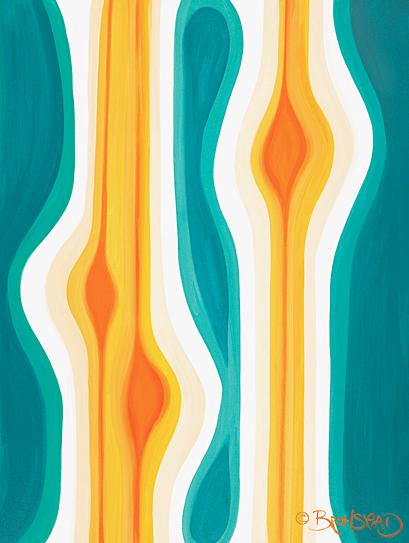
Here he seems to be using warm, inviting colors. The pattern almost seems like rain falling down on a canvas and creating a painting. He seems to be using dark and light colors, and conveys a cheery (lets stay in bed and listen to Sinatra and drink hot chocolate) mood. The surface looks to be smooth and he uses colors that blend well together.