Wednesday, November 14, 2012

Project 3 designers

Rachel Harrison


She uses the element of color by reflecting the tones and making your eyes wonder from top to bottom. The colors are bright, kind of like a field of flowers. I would associate her colors to be light and convey a free flying, twirling, laughing in the rain mood. The texture she seems to use most of the time is a bit rough and clumpy.


In the picture above, she seems to use warm colors, but adds a splash of lime here and there.


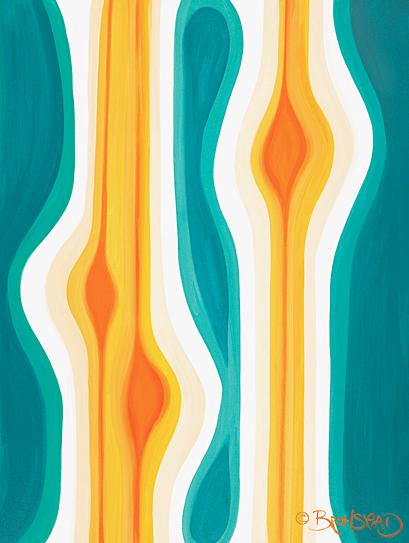
David Bromstad


Here he seems to be using warm, inviting colors. The pattern almost seems like rain falling down on a canvas and creating a painting. He seems to be using dark and light colors, and conveys a cheery (lets stay in bed and listen to Sinatra and drink hot chocolate) mood. The surface looks to be smooth and he uses colors that blend well together.


Thursday, October 18, 2012

Zhan Wang hw4


Image 1


Image 2


Image 3


Image 4


Image 5

       I chose Zang Wang because I believe he brings his art to life. He uses all the elements of structure in his makings. In image 1 he uses the surface quality of matter. I would represent this as an actual texture. You can touch it and immediately know that its cold, hard and bumpy. In image 2 he uses a lot of lines, or in other words the edge of mass. Some of the lines are not plainly seen but they are jagged and non symmetrical. Image 3 caught me by surprise, because the texture really did affect my senses. I did not know whether if the sculptor was smooth, bumpy or a mix of the two. Image 4 had really goof natural coloring of the actual material. The color plays a big role in the structure , because it not only has natural coloring but a great distribution of light that catches our eyes. Lastly, image 5, is quite massive and has great examples of lines. The plane is flat and curvy, the texture has the quality you can touch(by touching it you know if it's rough, smooth, or bumpy). The color on image 5 is a mix of dark light and natural coloring.
         This artist has a way of using all the natural elements to catch our eyes, especially with the color.

Sunday, September 23, 2012

Final master piece


Presto!!!!
 

The night is young

 
I just wanted to take the logo on this shirt.


All I did was cut out the logo and paste it on my final product.


Proud to be an American


Have no clue why I choose this flag, but my best guess is because it was soft and I found it in my attic.


I was in the zone when I deconstructed this flag so I appologize. What I did was cut the flag in strips and glued them all back together.


Christmas sock


Could not find the pair so used just this one.
 
 
You Dancer, prancer, comet and....


All I did was cut open the sock in half and unattached the top. My original plan was to cut the stripes of color apart, but it was difficult.
 

I just wrapped the rose in the christmas sock to give it support.


London shirt


There was no reason behind this shirt other than the texture, print and color.


I used this shirt as a bottom support stucture for my final product. I wanted as much support as possible so I folded the arms and the bottom of the shirt.


As you can see I placed the stuffing from the pillow onto the shirt. I used my hot glue gun to keep the stuffing attached together.